Dept. of Probation
Resource Hubs
The Cooper Hewitt Museum of Design's current show "Designing a Better America" features 60 projects for the 'other 90%' including our work for the NYC Department of Probation.
The NYC Department of Probation (DoP) supervises people who have been convicted of a crime and sentenced to probation (non-incarcerated supervision) at 22 centers located in various buildings throughout the City and, increasingly, at the Neighborhood Opportunity Network (NeON) in communities where clients live. DoP is not to be confused with the NYS Department of Parole, which supervises people after they have been released from prison. Probation clients, adults, young adults and children, include everyone from turnstile jumpers to those convicted for much more serious crimes and everyone in between.
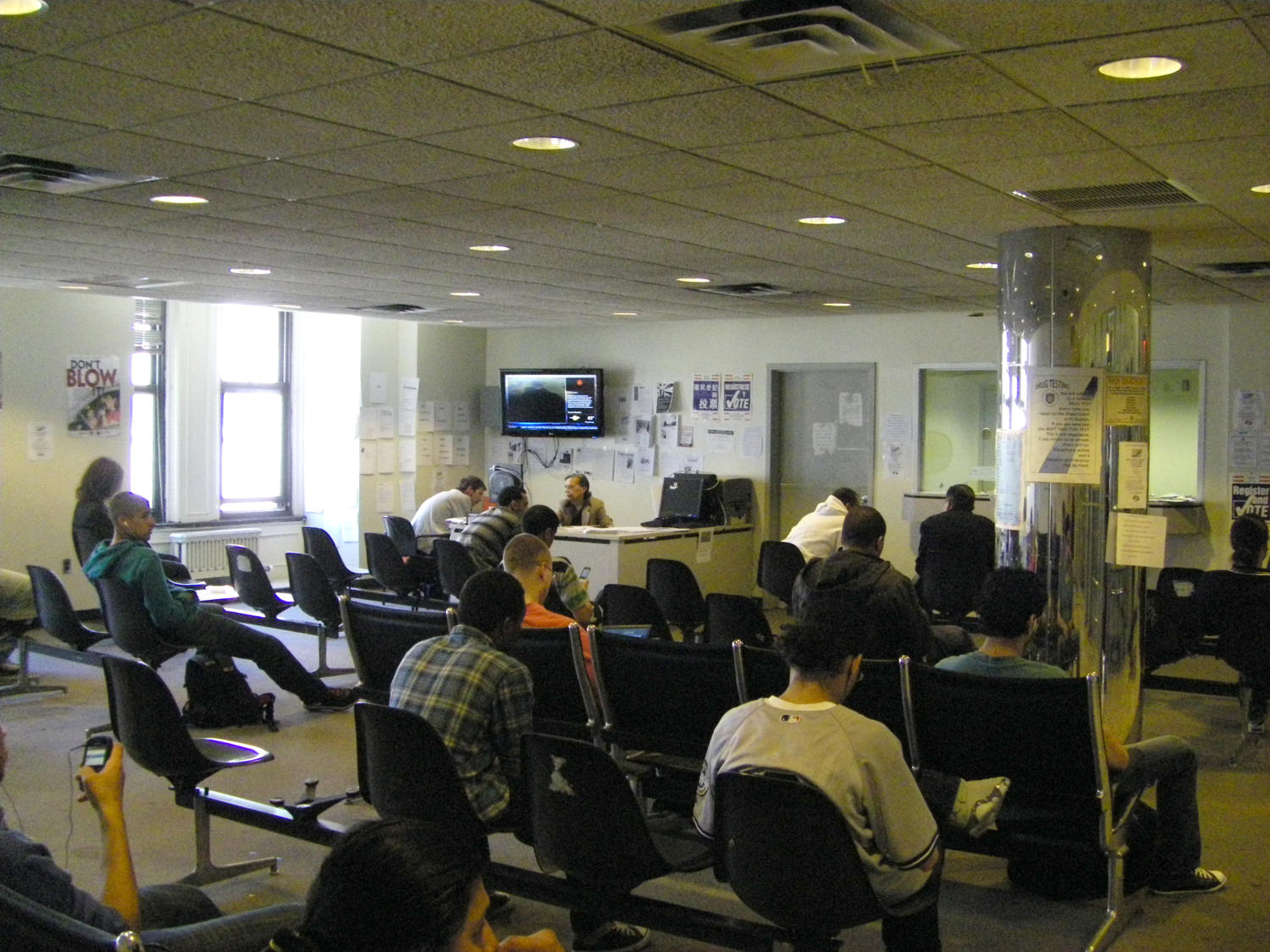
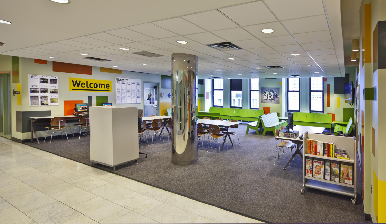
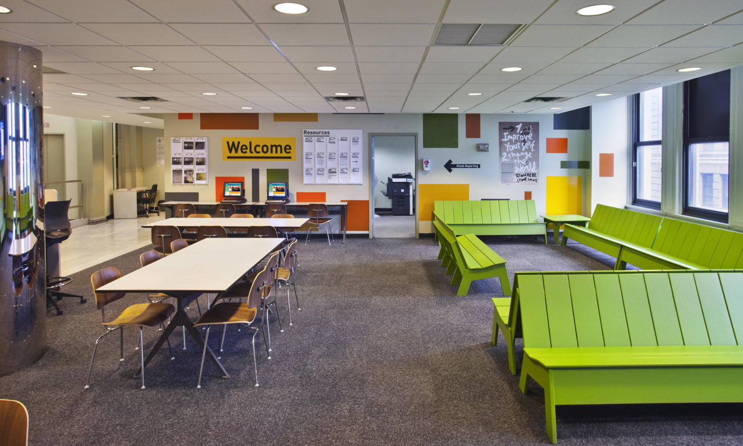
For a population we should be working hard to keep out of prison, the agency’s 22 waiting rooms don't exactly encourage reform. They are some of the most depressing, worn-out, emotionally debilitating places imaginable. Distressed furniture bolted together in rows; signs prohibiting talking, eating, cellphones and just about everything else; and a dreary mood reinforced by every nuance of the ‘décor.’
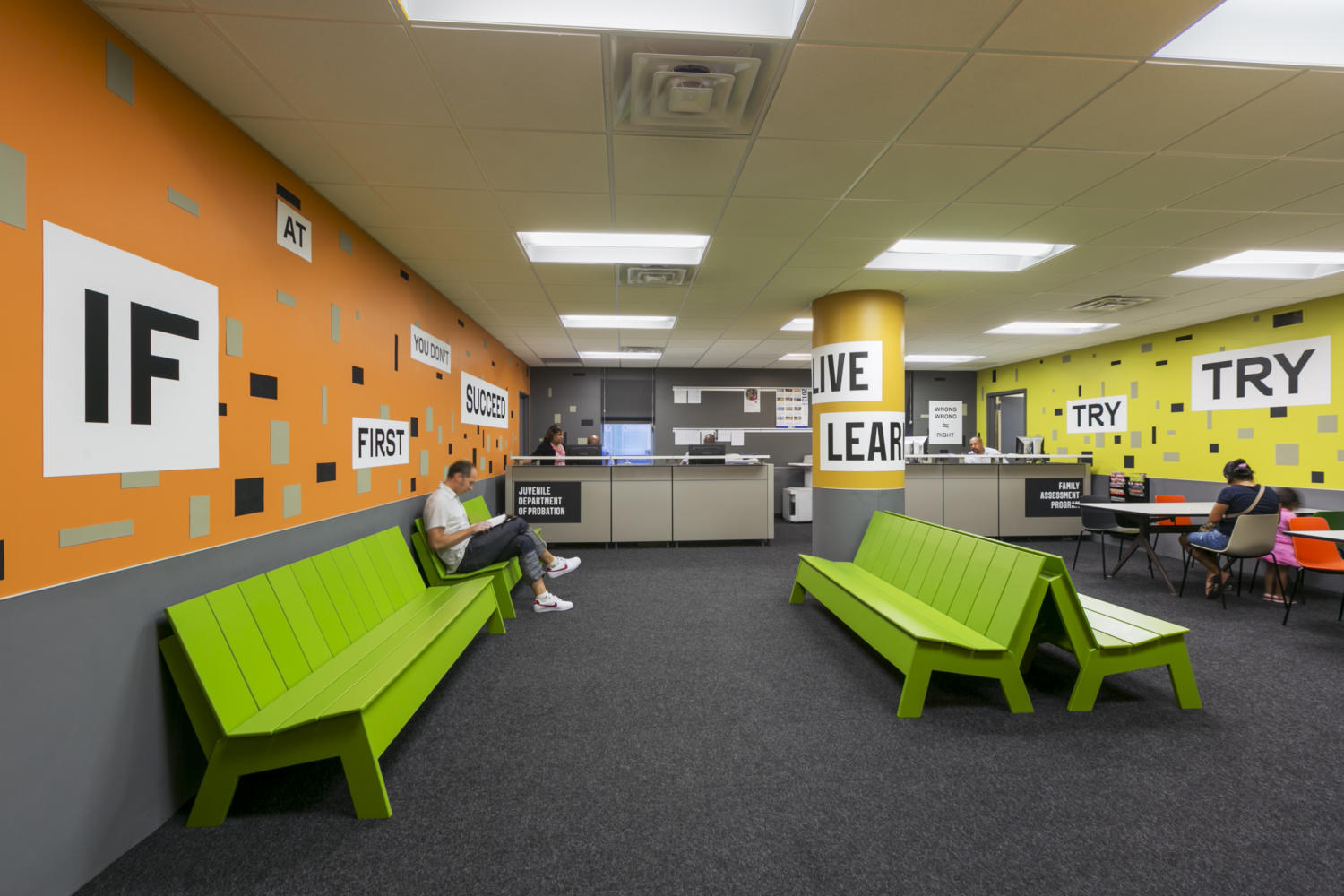
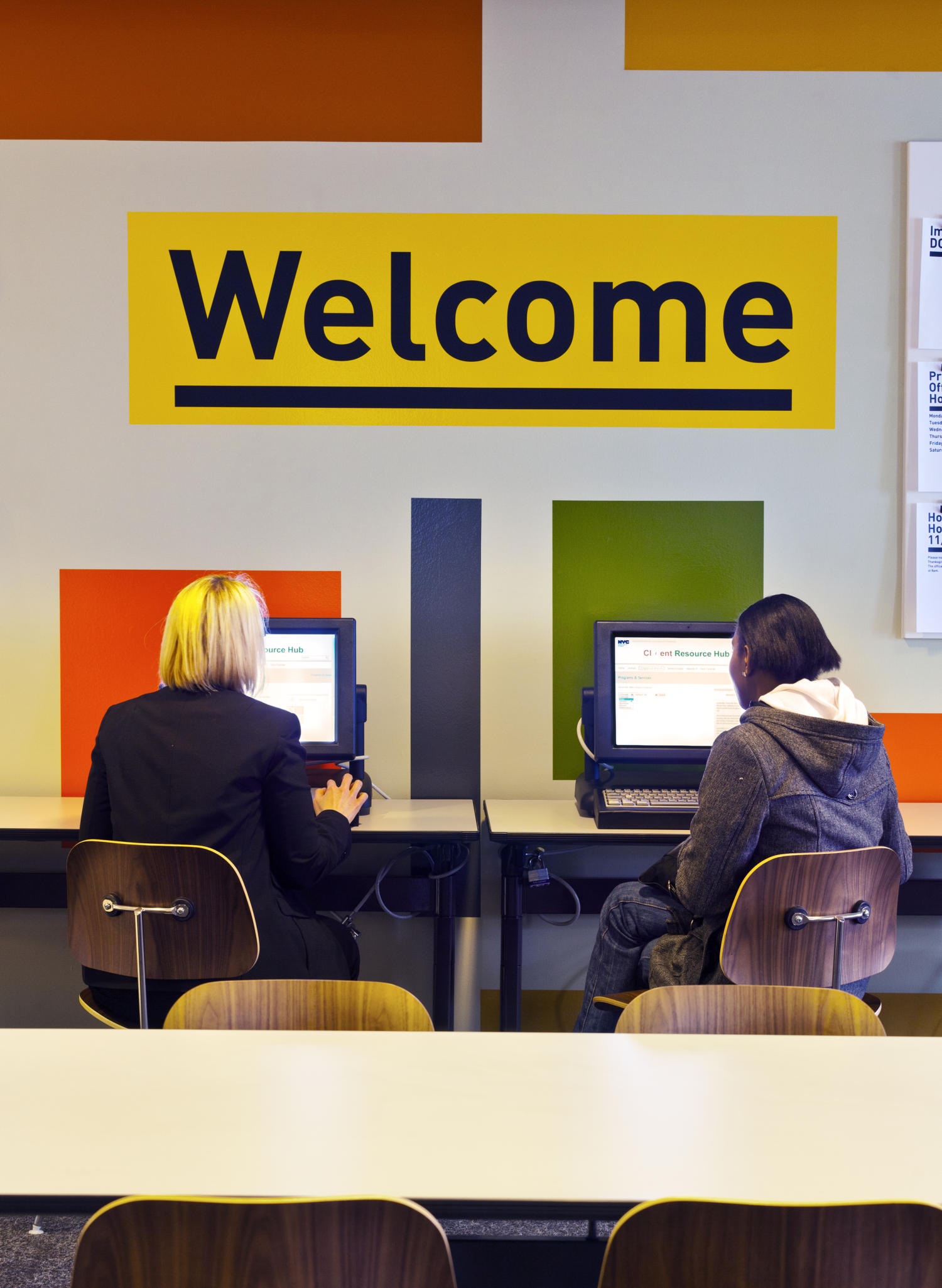
Working with Lonni Tanner, Chief Change Officer of the NYC DDC's SeeChange effort, we are helping to change the point of contact between these clients and the government. The waiting rooms, which are being transformed into "Resource Hubs", show what can happen when you combine a dynamic Commissioner with a motivated staff and a creative design team to forge a veritable engine of accomplishment.
We all spend more time than we would care to admit waiting. Airports, subway platforms, supermarket lines, phone menus that invariably direct us to a further wait are all part of the pain of modern life. The dividing line between frustration and satisfaction is whether we can actually accomplish something while waiting. It's not just waiting if you get something done! This simple idea guided us through the design. Our goal was to make the Hubs useful, and to make them look like the City cares about helping.
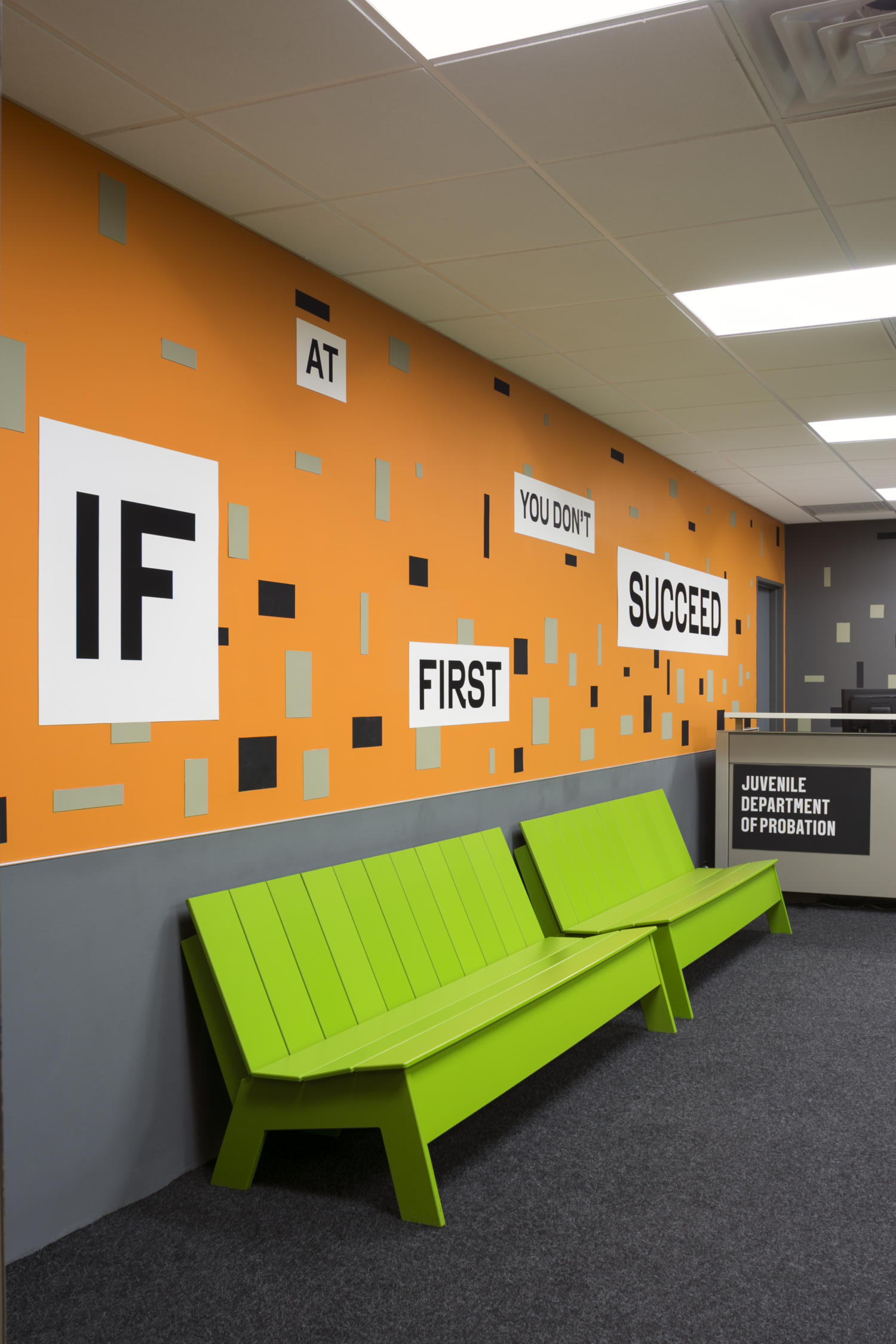
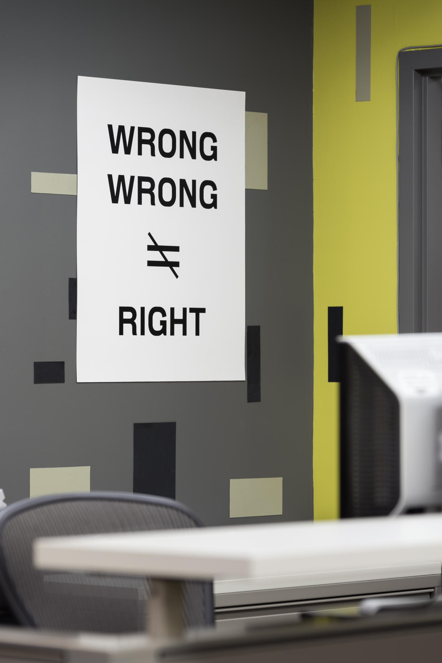
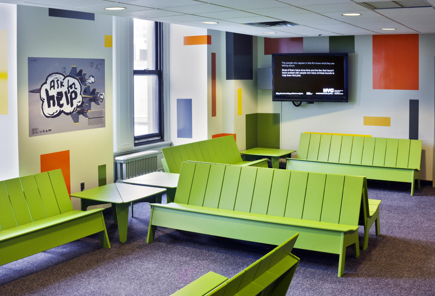
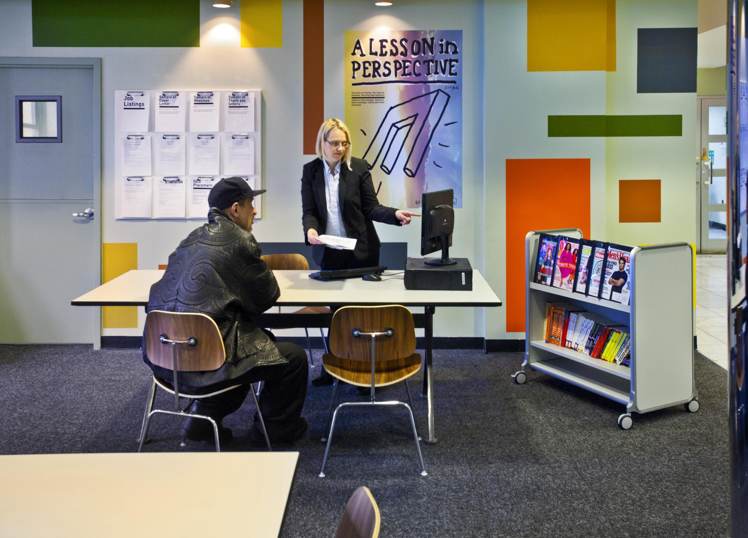
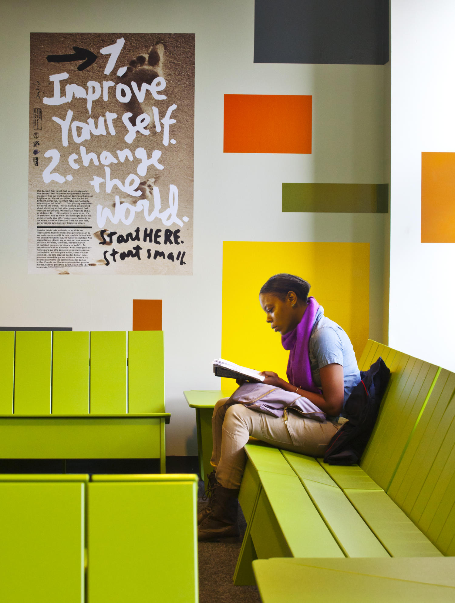
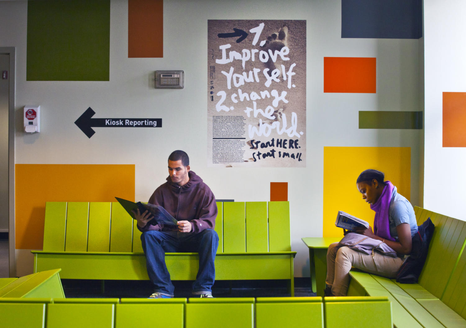
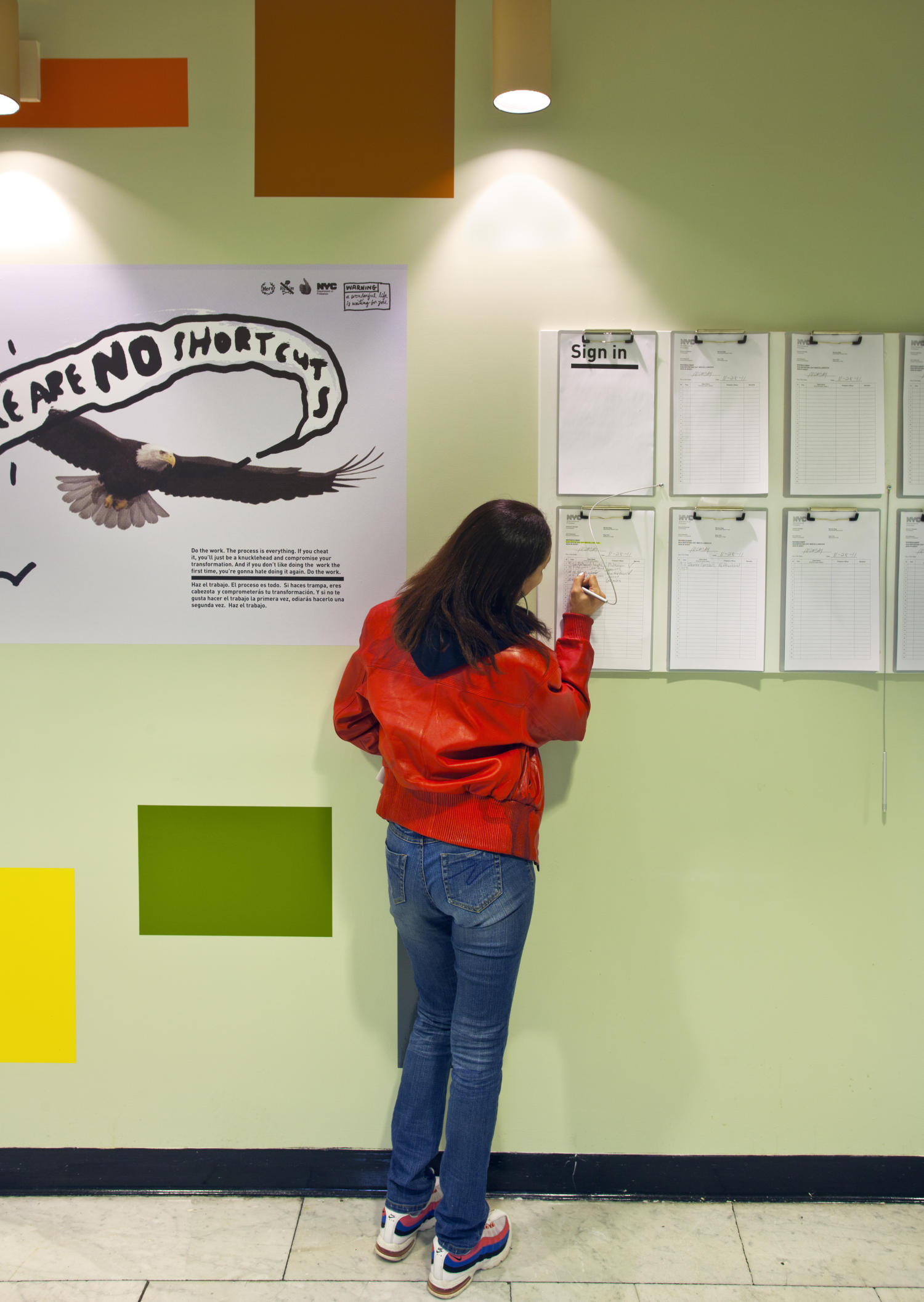
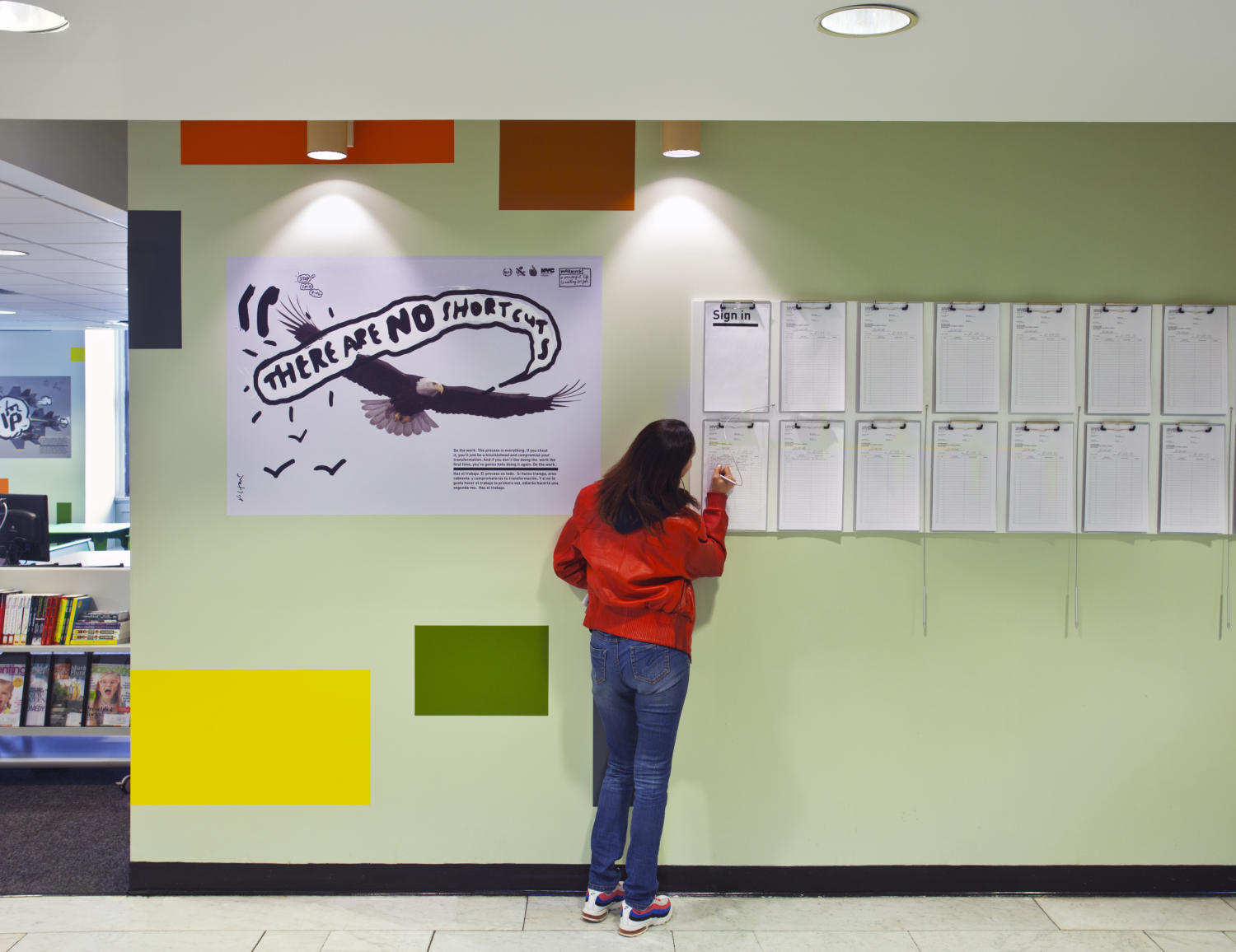
We invited James Victore, noted graphic designer with a strong political and social voice, to rethink the typical motivational posters ("Hang in There!") with his take on advice for probation clients. The posters’ tone of voice, coolness factor and authenticity transform an easily parodied 'artform' into genuine think pieces. James also reformatted the miscellany of posted notices ("No eating, talking, sleeping, cell phones, weapons, fighting") with easy to absorb, foolproof templates. Now the information lives on white boards with clips attached to organize the chaos giving real legibility to the potential chaos of information.
Realizing that any wall color, unrelieved or dotted only with the random paraphernalia that accumulates over time, is inherently institutional, we invented a 'gallery' of colors and shapes to cover the existing surfaces. The result is a collage that accepts all the necessary and leftover items of the past, making sense of the information while establishing a hierarchy of important messages. No desks, cubicles or other 'protected' spaces for staff were located in the waiting areas, either. If the message is 'we need protection from you' or 'this is our territory,' then the space is inherently undemocratic and discourages open and free use. Now, the result is more salon than waiting room, more information-rich than sensory deprived. It is a place where work can get done.
Finally, the furniture was selected from NYC-approved vendors to be durable without being cold or prison-like. No upholstery was allowed (to avoid cutting and staining) and certain colors were out of the question. In fact most colors were out of the question...we had to avoid anything that was associated with a gang or was white (impossible to maintain) or brown (our own rule) or too trendy.
In the end we found all the colors we wanted in the 3M sample catalog for signage film. These washable, easily applied and membrane-thin sheets were affixed like permanent 'Colorforms' to the painted walls. The furniture includes plastic benches designed for outside use that are constructed from recycled milk cartons and available in gang and non-gang colors, along with the incredibly sturdy and dependable Eames DCM chairs.
Taken together, and along with the myriad other changes in the department – including deploying Greeters and Resource Advisors -- the design of the Resource Hubs signals an ongoing change in the way clients experience the probation system and a truly significant shift in the relationship between city and citizen.